by Lewis
There are a million ways to improve your content…
Keywords, semantics, multimedia, the list is endless.
However, one factor that gets kept in the dark is eye flow.
This is shocking considering a few simple tweaks to the way your page controls eye flow can drastically improve conversions and on-site dwell time.
In this guide, I’m going to breakdown this unknown concept and provide you with practical steps on how you can utilise it to boost your online marketing strategy.
Let’s jump straight in (or jump to a certain section using the links below).
- How do people read content online?
- Left vs. right – where should marketers focus their attention?
- F-patterns and how they influence your content
- How to design content for the F-pattern
- Z-patterns and how they influence your content
- How to create landing pages to benefit the Z-pattern
- How do individual page elements control eye flow?
- How headlines can command attention
- How do images control users’ attention?
- Using images for directional cues
- The importance of the fold
- Increasing white space on your site to influence eye flow
- How can you test how your audience is looking at your site?
So, how do people read content on the web?
Before you get over-excited and start frantically moving elements of your site around, you need to understand how people read a website when they first land on it.
Although the next few tips are going to seem common sense, it’s important to know common sense is not common practice! And you’ll be surprised how many websites mess up even the simplest of design tweaks, costing them sales and increasing bounce rate.
Left vs. right – where should marketers focus their attention?
In general, the majority of individuals first read a page from left to right…
And yes, we get this might not come as a surprise to many of you; it’s common sense!
However, what’s important is how the eye transverses along the page AFTER it has begun scanning from the left.
With this information, marketers can position CTAs and important information where their viewers are fixating, thus leading to more conversions.
There are two core reading patterns people follow when they’re scanning content on the internet:
F-patterns and Z-patterns.
Let’s explore what these are and how they affect where you should place your most important elements.
F-patterns and how they impact your content
One of the more commonly known eye flow paths is the F-pattern.
A lot of research has been performed on eye flow and eye-tracking, and study after study has concluded that the F-pattern is one of more frequent motions on the web.
The F-pattern is categorised by two horizontal reading lines followed by a straight vertical line, which travels down the left side of the content. Therefore, creating an ‘F’ shape. 
With this pattern, the top left of a page receives the majority of viewership. However, viewership tends to decline after the first two lines of content until it disappears entirely. In fact, studies have found the left side of a page receives more overall fixation than the right… hence why you often find heavily tested eCommerce pages placing their navigation bars on the left-hand side!
Interestingly, these patterns can also be seen across all site-types, whether it be eCommerce, blogs, and even search engines. ![]()
But what does this all mean for your site? Unfortunately, it isn’t good news.
All this research essentially means the majority of your content is being missed as eye flow deteriorates as users move further down the page!
In fact, studies have found that the F-pattern is a key reason why only 28% of online content is actually read.
So, the real question becomes this:
What can webmasters do to combat this loss of viewership?
What can they do to stop their audience from bouncing off and, instead, keep them locked in and engaged with their content?
How to design content so it benefits the F-pattern
Unfortunately, people are lazy…
What this means is they’re unlikely to change their skimming and scanning ways when it comes to online content. So, you need to design your page to aid their laziness, so they get the most important information first.
With the F-pattern, research suggests you should be including the most important information in the first two paragraphs…
This is because after the first two paragraphs, viewership declines and you’ll lose your audience if you leave the most important information at the top of your page.
Also, make sure you’re using headings and subheadings to break-up content, ensuring the first few words of the heading explain exactly what the content in that section is about.
Using bullet points and lists is also a great way to pull users’ eyeballs down the page, so use these where you can.
Lastly, make sure you’re ONLY including content that is relevant… drop anything that doesn’t relate to the overall scope of the article.
Follow these simple steps and you’ll see your dwell time rocket!
Z-patterns and how they impact your content
Now that we’ve discussed the F-pattern, it’s time to investigate the mysteries of the Z-pattern – a pattern that is seen less-often but one that is still important to understand.
The Z-pattern follows much of the same principles of the F-pattern.
However, the main difference is that users’ eye flow moves left to right, then diagonally to the left, then right again. 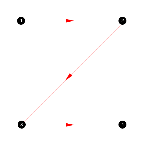
In some design circles, this is known as the Gutenberg principle.
A key difference between the two patterns discussed revolves around the particular pages they’re found on.
Z-patterns are more likely to be found on content-heavy conversion-based landing pages, whereas the F-patterns are more likely to be discovered on articles, blog posts and SERPs.
In general, the Z-pattern suggests that viewers’ attention is primarily fixated on the top left of the screen when they first start engaging with a landing page. This attention then flows in around the page, eventually ending at the bottom right.
Even Google recognised this pattern as a key force that governs attention!
Because of this, they coined the term ‘the golden triangle’ to account for the attentional importance of the top-left section of a landing page. 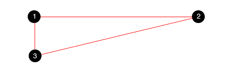
How to create landing pages to benefit the Z-pattern
So, how do you, as a marketer, create the perfect landing page that complements the eye moving motion of the Z-pattern?
Simple.
Include all the most important information in the top-left section of the page. For conversion-focused landing pages specifically, include as much information about the product or service in the ‘golden triangle’.
As for the CTA, place it on the bottom right of the page, as this is where the eye flow will finish.
If the user has viewed all the information, taking action on the CTA should be frictionless.
However, do bear this in mind before going all-in with the Z-pattern:
This eye motion is likely to be seen on ‘above the fold’ style content.
As your audience begins to scroll, they may start exhibiting an F-pattern, so be sure to account for both patterns when designing a larger landing page.
Individual elements – how do they control attention & eye flow?
Hopefully, you now understand the basics behind how your audience is scanning your site and its content.
So, let’s focus on something different for a second; the individual elements of your content.
Elements like the header, the pictures and the CTAs. All these have an influence on whether your audience will stick around and convert, so why would you ignore them?
In this next section, we’re going to walk through various elements of your content and how they can impact audience attention.
Let’s get stuck in.
Headline dominance – how does the headline control attention?
One of the first things your audience sees when they land on your page, whether it be a blog or an article, is the headline.
According to Copyblogger, 80% of people read your headline but only 20% read the whole article! ![]()
So, depending on how it is designed can make or break your conversions and dwell time.
If your landing page doesn’t have an interesting headline, you can kiss your traffic goodbye.
How exactly can webmasters improve their headlines so people don’t bounce?
Studies have indicated that larger headlines attract more attention when a user first lands on the page and that the level of attention increases when the headline is placed in the top left of the page…
By increasing the size of the header and pushing it to the left, you have an excellent opportunity to present the core benefit to encourage the reader to continue through the rest of the article.
If you can hook your audience here, you increase your chances of keeping them reading and not bouncing off early, which hurts you UX metrics.
And here’s a sneaky tip:
Try and get the benefit of your landing page in the first few words of your headline. People scan down the left side of the page, so make sure they understand the core value proposition as soon as they arrive.
2 data-backed ways to increase readership using headlines
- Include hyphens and colons in your headlines. The Content Marketing Institute found they increased CTR by 9%!
- Include specific numbers (particularly odd number). Studies have found they increase engagement by 73%!
How do images control users’ attention?
Another important element that has control over your audiences’ eye flow are images.
Images are not only great for boosting your on-page SEO efforts, but they can also be an effective way to force your users’ eyes around your page to important focal points, like CTAs or forms.
Eye-tracking studies have found some interesting finding in regard to images.
Large, crisp, high-resolution images perform best at attracting the most attention on web pages…. But this is very common sense.
What isn’t common sense is that people prefer to look at images with ‘normal’ people in them who are smiling and staring face forward and prefer these kinds of images to models.
If you want to draw attention to particular pictures on your landing page, using genuine human beings and avoid using unrealistic models who don’t offer the same kind of relatability.
You know the ones we’re talking about…
The cheesy stock photos where everyone is happy and smiling with their thumbs up in front of a white background.
Yeah, avoid those.
If you want to know the best pictures to use on your site for maximum attention, use pictures of babies and women. Studies have found they draw the largest amount of fixation.
Research even indicates we are naturally inclined to look at babies faces… so if you have the opportunity to sneak in a baby pic, go for it!
Using Images for Directional Cues
Another creative use of imagines if by using them to promote a directional cue.
“How do you do that?” I hear you ask…
It’s simple. And comes back to using human faces again!
Studies have found that you can control people’s attention by simply positioning the gaze of the individuals in your pictures towards points of interest (such as CTAs, etc.). 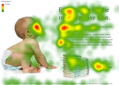
Humans have a natural tendency to follow the gaze of others, so it only makes sense to use this to your advantage when you’re designing landing pages.
Also, it’s not just human faces and gazes that can create a directional cue.
Arrows have also been found to be a persuasive mechanism to guide people’s attention. And the effects of arrows are similar to that of human faces, which is particularly interesting!
By pointing an arrow towards a main focal point on a landing page, you can control your audiences’ gaze much better.
And you can even use arrows to help individuals progress down your page, below the fold.
If you want to give your directional arrows a significant boost, try giving them a ‘hand-drawn’ style, as they can further increase their effectiveness; it makes them more nostalgic and personal.
Using images to draw your eyes down a page
Ever heard of David Ogilvy?
He’s considered by some as the modern father of advertising… and for a good reason too!
His findings on images and readership as very interesting and he found placing images properly on a page could drastically improve eye flow down the page as well as to important piece of text.
In one of his studies, he found placing an image ABOVE the headline increased readership by 10%.
Putting that into perspective, if you get 100,000 impressions on your article, 10,000 people are being lost (by not reading it) if you place an image in the wrong place.
In another one of his studies, he found people read the captions under images 300% more than body copy…
He suggested that captions should be used to push the main point of your article, as this will be viewed by your audience.
The latter findings mentioned have been used in print and magazines for years, but they have yet to fully enter the online world.
Start adding images before the headline and add captions to every image. Test it out and see if your dwell time increases!
The fold – does it matter as much as people say it does?
The fold. A controversial subject for some.
Some marketers rave about it, saying that all information needs to be above the fold as people refuse to scroll past it. Others say the opposite.
But who is right in this situation? The evidence will surprise you!
Contrary to popular belief, people do scroll below the fold and it’s a lot more common than you think. 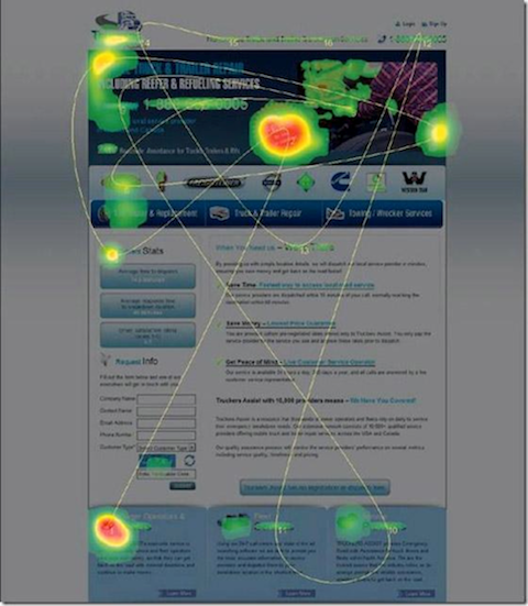
However, relying on the fold to do all the heavy lifting in terms of conversions and UX is a mistake that marketers make far too often. The fold should have the most important information, but it shouldn’t be filled to the brim, as this can have the opposite effect.
Above the fold content is viewed more than below the fold content, and since you only have 8 seconds to capture your audiences’ attention, the content needs to be compelling.
Simple tactics like including a CTA above the fold can increases conversions as much as 21%!
However, never neglect the bottom of your page…
Several studies actually indicate that conversions actually see a boost when there is a CTA at the end of the page, so make sure you’re following this advice.
But what about mobile? How does the fold affect readability?
Interestingly, the fold actually matters less on mobile.
One study found users began scrolling within 10 seconds of being on-page, and 90% started within the first 14 seconds.
Maybe people aren’t as impatient as they’re made out to be?
How can increasing the white space on your site influence eye flow?
Sometimes less is more…
And with web design and content structuring, this is definitely true.
The last thing you want to be doing is stuffing your landing pages with too much information; you’ll only end up losing your audience. 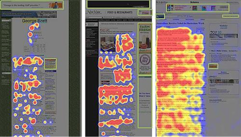
Having more white space on your landing pages can have a positive effect on both conversions and dwell time, as it allows your users to navigate the page better, preventing any confusion.
When it comes to content, such as articles and blogs, including more white space (known as negative space in design) can also help comprehension.
You can literally help your audience learn quicker by including less on your page!
Negative space can have a huge impact on eye flow, helping your audience navigate around the page.
For this reason, it might be worth stripping a few elements from your landing pages and spreading out sentences.
You never know, it might increase your dwell time!
How can you test how your audience is looking at your site?
Every site is different. Some of these tips will work and some of them won’t, and sometimes it’s better to just analyse your landing pages and see how people are viewing them.
To do this, you’ll need heat mapping software.
They allow you to see how your audience is moving around your landing pages so you can start to optimise where to position your important content.
It will also give you an opportunity to start applying some of the advice we’ve offered above and identify what works and what doesn’t with your site.
Our favourite tool to use is Hotjar.
Head over to their site and check them out, they make mapping users’ interactions a breeze.