Intention in SEO can be a tricky thing to master for any brand and industry.
In the outdoor retailer space, however, it seems a select few brands have managed to pioneer some interesting strategies to provide Google and its users with exactly what they’re looking for. As a result, they’re being rewarded with visibility and positive UX metrics.
These brands include Trespass and Ellis Brigham.
What are they doing to match the intention of keywords?
Read on to see the breakdown.
The Importance of Intention
Some of you reading this now might not have a clue what I’m talking about it comes to intention on the Search Engine Results Pages (SERPs).
In a nutshell, when someone searches a keyword on Google, they’re looking for a specific thing, and it’s Google’s job to assess what would satisfy their ‘intention’. Aka, what they’re looking for.
Google’s algorithm is fluid and ever changing to ensure the correct sites are shown to users to make sure they’re receiving the information that they desire. They do this via checking on-page signals, although the specifics of this are speculatory. Google keeps their algorithm close to the chest.
Nonetheless, if you’re able to deliver the right page to the right audience, who are searching for your exact content, you’ll be able to achieve great spots on the first page.
Of course, nailing this is harder than it sounds.
Many businesses, especially in the outdoor retail space, stumble around and fail to align with the intention of some keywords. We won’t detail who these brands are, but they exist.
Some brands, however, align well with intention and satisfy the needs of the audience. These brands include the likes of Trespass and Ellis Brigham.
From our POV, they’re working toward the right goal, supplying the right kind of pages that their customers will love.
Trespassing on Trespass
The first tip comes from Trespass’s site.
In fact, when looking at a lot of the big brands for outdoor retailers, they also utilise this cool method to segment their audience and qualify buyers.
However, when I went down the list in our industry league table, this tactic became less prevalent.
So, if you’re a smaller brand, this might be more relevant to you and I suggest you pay attention. This could help you attack different keywords and obtain more visibility.
Filtering by Activities
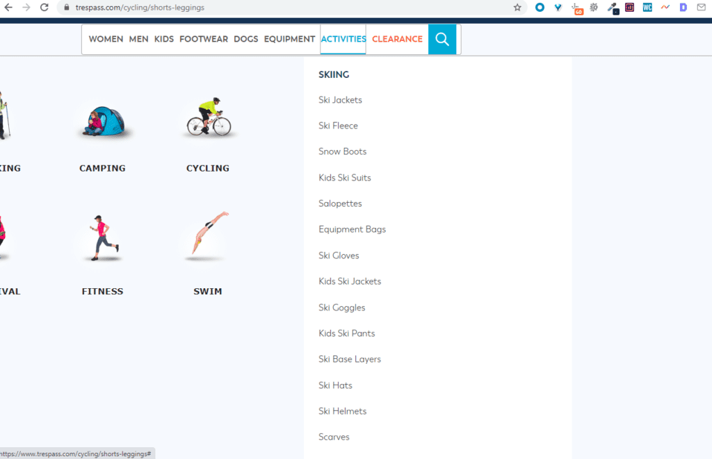
When looking at Trespass and some other large sites (Go Outdoors, Millets, etc.), they have a prevalent mega menu that is different to other, smaller brands.
That is, they allow people to filter by activity.
Trespass do:
Go Outdoors do:

Cotswold Outdoors do as well:
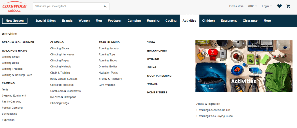
All the big brands allow customers to filter by activity.
Now, it may be the case that they’re all copying each other, but it might be the case that they’re seeing an uplift in sales by doing so.
This kind of segmentation allows customers to find exactly what they’re looking for with ease and allows those who are passionate about a specific activity to find what they’re after. Consequently, they rank better for activity-based keywords, as each one has an entire category dedicated to it. In Google’s eyes, this is a good thing.
If you’re a smaller brand and want to start segmenting to help your audience find what they need fast, adding an activity category could be the way forward.
Taking a Leaf Out of Ellis Brigham’s Book
Ellis Brigham offers a few unique ways that outdoor retailer brands can start targeting intention better in the SERPs.
In fact, both of the strategies are ones we use for our own clients, and they’ve seen quite an uplift as a result of their implementation.
Gateway Pages to Funnel Broad Searches
When we take on ecommerce website, the first thing we notice are the ‘all’ pages.
These are the pages that display all the products in a given category, allowing customers to filter using toggles at the top or on the side of the product list. We’ve all seen these and are more or less used to them.
However, there is a better way at aiding people’s searches that some brands have yet to adopt and they’re called gateway pages.
These are pages that allow the user to qualify themselves and find what they’re looking for with ease. Instead of a big list of products, they show a page which allows people to select a more specific category.
Check out Ellis Brigham, for example:
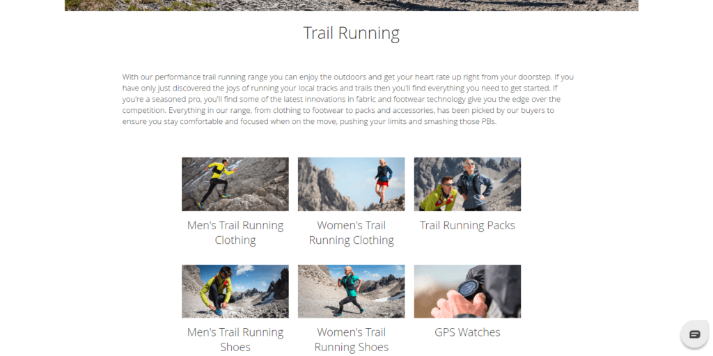
Instead of a big list, you can pick a tile and get more specific with the product you’re looking for.
Although this looks like a simple alteration (because it is), it actually can have a profound impact on dwell time and bounce rate.
We did something like this for Dreams a while ago.
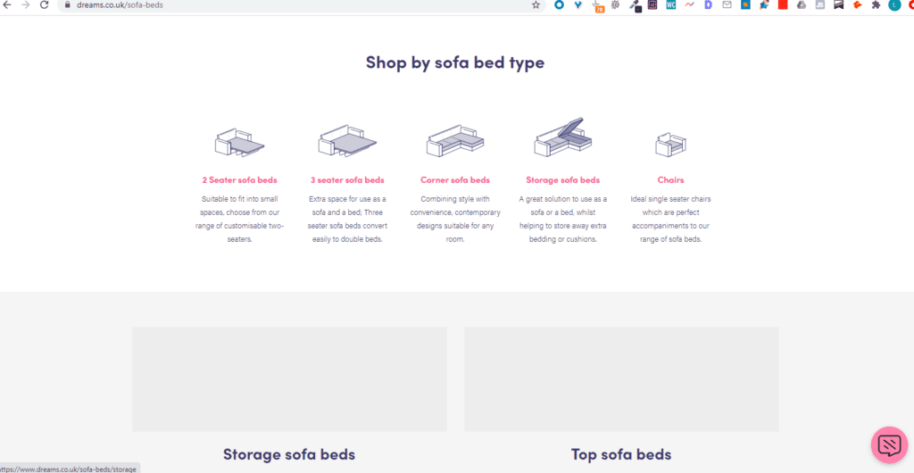
That is their sofa beds category page.
As you see, there aren’t any products, just a list of more specific categories that the users might be interested in. These work great and are recommended if you’re looking to lower your bounce rate and improve your session time, which all give your page a better chance at achieving a better rank on Google.
Buying Guides and Consideration Content
Buying guides are a must in 2020 and beyond.
They are superb at deepening your categories and giving more relevance to your site, letting Google know you’re an authority in the industry. They also help to guide users who are not at the ‘purchasing stage’ of the buying cycle to push them into an informed purchase.
Thus, they’re great for matching and guiding intent.
Ellis Brigham have a collection of well-designed buying guides which you should definitely be paying attention to.
Take their walking shoes guide:
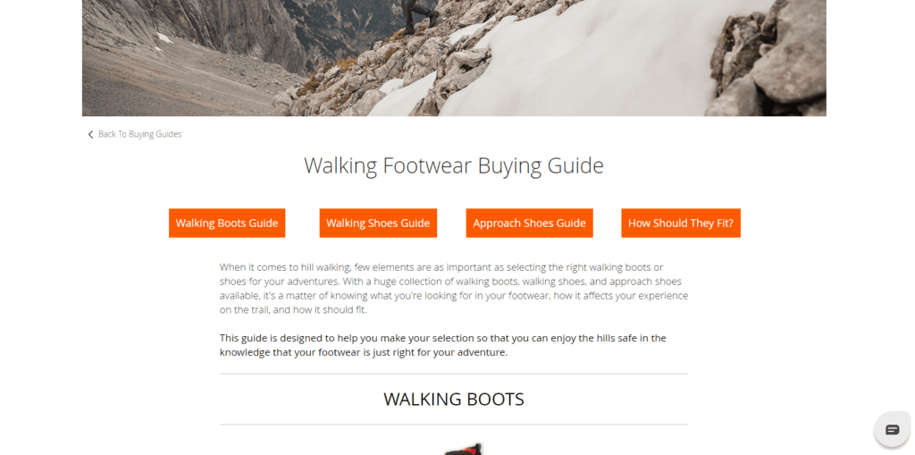
It is a beast, clocking in at over 1700 words.
This content is excellent at helping those who have no idea how to buy a walking shoe.
Google also reads this content in the context of everything else on the site, like the walking shoe category. Thus, the more guides and intent-focused content you have built around your categories, the more ‘weight’ Google will give to them when ranking.
And this guide is just the start.
Ellis Brigham has a whole bunch of buying guides that help guide people from amateur to master when it comes to specific products.
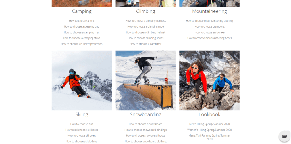
Whether you’re snowboarding, walking, or camping, Ellis Brigham has a guide to help you.
Outdoor retailer brands need to pay attention here and apply what they’re seeing to their own websites.
Quick Disclaimer – These Sites Aren’t Perfect
I want to quickly state that, although these sites are satisfying intention, delivering the right content, and guiding people smoothly towards the purchase, they’re by no means perfect.
These two sites are not the industry leaders and they do have their issues.
Trespass, for example, has a mega menu that cuts into the side of the screen. Not great from a design UX POV and it can’t look great from Google’s side of the table either.

Ellis Brigham also has its problems.
For example, they only ranked in position 11 overall in our outdoor retailer league table.
They also suffered a loss of -33% YoY. Clearly, they’re not perfect.
Yet, saying all this, they still have a lead on the intention game. Many of the pages above are excellent examples of what ecommerce brands in the outdoor market should be displaying on their websites. In our own research and experience, pages like these improve a site in a number of ways. Specifically, through improved UX metrics and category depth.
Don’t take these sites as examples of the perfect website though. Just take the examples and tactics listed above and implement them into your own strategy
Summing it up…
Trespass and Ellis Brigham have something to teach every brand about intention.
Although all of the above examples are a good way to manage intention and target it better, it can still be a case-by-case example. It’s important to look into the keywords and the results that rank for them to analyse what Google is expecting.
However, this can be a longwinded process and without the right tools, it can be a difficult puzzle to put together.
If you want help with your outdoor retail brand and want to better target intention, get in touch with our experts now on here.
