by Gemma
Charities rely heavily on donations to be able to carry out the amazing work they do every day.
While you need your landing page to give valuable information about the charity and the work it does, you also need it to convert visits into donations. These are the fundamental components your page must have to be able to convert well.
Page layout & focus
The overarching rule for the layout and focus of your donation page should be this: keep it simple. Make your conversion landing page do one thing and do it very well. As much as we’d like to believe we’re all extremely intelligent, multi-tasking professionals, the truth is we’re easily distracted. Give your page a clear focus and don’t clutter it with loads of other information. That way, you’ll steer your user to fulfil your goal; they’ll donate.
Clean design
Minimal clicks, minimal effort, maximum payoff.
With not-for-profit landing pages, the less fussy the design, the better. If it’s busy or fussy, it’s unlikely that people will spend their time searching for what they’re looking for, whether that be a donate button or information about the charity. Keep the font clear and easy to read and have your most important links visible and clickable straight away.
Your donation button should be above the fold. Don’t make your users have to scroll to do what you want them to do.
Donation forms are also extremely useful. Some charities offer the option of clicking on pre-set amounts, keeping the process super straightforward. Make donating as easy as possible.
Minimal clicks, minimal effort, maximum payoff.
Images
Use your images wisely. You don’t need to have a lot of copy on the page if you have powerful images backing your headlines and subheaders. Images that depict the end goal offer a positive user experience and show users what they could be helping to achieve with their donation.
You can also use a principle called ‘gaze following’ to hopefully maximise conversions. The principle highlights that our eyes follow what other people are looking at. So, if you have an image of a person or animal looking straight down the lens, your users’ eyes will fixate on them for the longest time. If, however, the photographed subject is ‘looking at’ a header or donation box, so will the user. This is a clever way to guide your users’ eye around the page and direct them to the most important page elements.
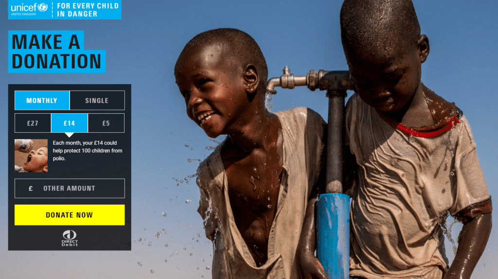
Unicef do this brilliantly:
- The little boy in the image is looking straight towards the page title which makes us look at it, too
- Your eye is then drawn to the bright yellow ‘Donate now’ button on the form
- The form is simple, and donors are shown where their money could be spent for three different set amounts
- The focus is entirely on the donation form. We can’t go anywhere else unless we scroll
The user knows why they’re here, they know what you want them to do and they’re unlikely to change their mind about donating at this point.
Standout donation button
Don’t make it difficult for your users to find the donation button.
It’s a no-brainer. If something stands out, people are more likely to see it and, therefore, click on it. Don’t make it difficult for your users to find the donation button. Use a contrasting colour to draw the eye straight away, like Unicef.
Chuffed changed their donation button from green to red and increased their conversions by about 50%. If making a change this small could have such a massive impact on your conversions, you’d be mad not to try it.
Copy
With such little copy on the page, you need to make your words count. You need it to grab people’s attention and give them the feels. You also need it to make them do a thing, that thing being to donate.
Use active verbs to encourage this behaviour. Give, act, reduce, improve, kickstart, or whatever you fancy. Target Marketing has produced this list of 55 words that convert if you need a bit of help.
Your copy also needs to make people feel involved. Tell people what their donation will do and who it will help rather than sounding preachy. Samaritans’ donation landing page is so simple yet so effective:
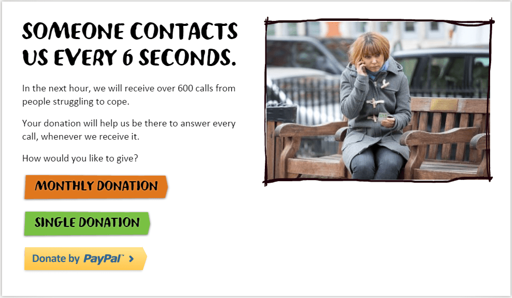
Even simple changes like asking ‘How would you like to give?’ rather than stating ‘You can give in three different ways’ could be the difference between increasing donations or not.
Make your copy count.
USPs
The USP of any charity is what it does. With so many charities around, people often have a difficult decision choosing which one to donate to. If they’ve landed on your page, there’s probably no doubt in their mind that your cause is worthy, but they may have reservations about whether their donations will actually reach that cause. Unfortunately, charity spending scandals are big news and stick in peoples’ minds.
People want to know where their money is being spent. You wouldn’t go to a business pitch without having evidence to back up your hard work, so why should you expect people to invest in your charity without showing them the stats?
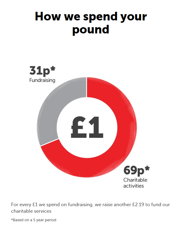
Using pie charts is a great way of showing statistics visually and can also be a fantastic way of showing donors where their money is going. This one is from Crisis’ donation page. If customers can see where their money is spent, they’re more likely to feel reassured that they aren’t ‘lining the pockets’ of charity owners.
Transparency = trustworthy.
Responsive design & speed
Again, this should be a no-brainer. With charity donations via text expected to increase by 34% year on year and mobile searches overtaking desktop searches this year, ensuring your page is responsive should be at the top of your list.
Pagespeed is also super important for ranking and keeping your users on site. A reported 53% of mobile users will leave a page if it takes 3 seconds or more to load. That’s more than half your potential donors gone.
Read our article about why pagespeed is important for more information on this.
Getting traffic
Ensuring a fully responsive design and lowering your pagespeed can help with organic rankings, but most charities rely heavily on Google ads to guarantee those top spots. The most important thing to do after creating your conversion page is to get people to convert.
A clever PPC campaign can revolutionise your conversion game. Our work with Crisis gained them a 57% increase in traffic, 42% increase in donations and an ROI of 32 during their 2017 Christmas campaign.
If you have a Google ad grant, you’ll obviously want to make the best use of it. This can be tricky as there are so many rules and regulations. Luckily, our PPC Manager Nate is an expert on the stuff, and he’s written this article all about it.
Read more about our Charity services.