SEO involves more than just technical foundations, site content, and keyword targeting. While these components contribute to your site’s ranking and visibility, many people overlook the impact of design. Web design, page layout, user experience (UX), and user interface (UI) all affect every aspect of your online presence and can influence your SEO rankings. Users and search engines like Google require your site to be functional, trustworthy and provide a great user experience.
In this article, we’ll discuss how web design affects SEO, what aspects of design you need to consider, and how to boost your rankings.
What Is UX And UI?
Some key aspects of web design are UX and UI, and they work together across your whole site, from page layouts to interfaces and more. UX is your user experience, how users interact with your site, and how clear and convenient your design is. UI is your user interface, which is the visual appearance of your website.
UI includes buttons, texts, images, content blocks, animations, and more. UX is your site speed, navigation, menu functionality, content, and overall interface design. Both work together in website design to achieve a particular user goal, whether that be more time on the page, better conversions, or improving how users engage with your site.
How Web Design Affects SEO
Focusing on making your site look beautiful while simultaneously focusing on the user’s emotions and ease of use, UX and UI work together to create experiences that are simple, efficient, relevant, and enjoyable.
How are these things measured?
- Engagement: A site with good design will have higher user engagement on page level and overall. Increased engagement leads to more time spent on the page and sharing the website with others, resulting in more traffic, improved rankings, and more conversions.
- Bounce Rate: This is where users leave your site after only visiting one page, indicating poor UX/UI. Search engines tend to rank sites lower with higher bounce rates, but optimising your site design can improve your bounce rate and get users to spend more time on the site.
- Click-Through Rates: Also known as CTR, positive design aspects can show higher clicks, showing search engines that your website is valuable and relevant.
All these metrics work together with your site’s content and technical aspects to improve rankings, traffic, and conversions. But it’s key to know that while UX can impact SEO, your SEO can also affect UX. Over-optimising your site for keywords may lead to poor UX, affecting engagement and rankings. Working together to balance these is crucial for good visibility.
What Google Says About Why UX Is Important To SEO
Google has increasingly been evolving in terms of how significant design and UX are to SEO rankings. While SEO aspects such as technical foundations, backlink profiles, and keywords are important, Google is shifting to a more user-focused approach. The introduction to EEAT shows that search intent, page speed, mobile friendliness, and overall design of your site are crucial for rankings.
A trustworthy site design with organised content, easy-to-use buttons, and navigation, followed by a streamlined site experience, encourages users to visit and stay on your site, which sends positive quality signals to Google.
Combining Design and SEO: SXO
Search Experience Optimisation (SXO) combines UX and SEO, recognising that they do affect each other and can work together to improve your site rankings and interaction. A successful SEO campaign will look not only at your tech and content but your UX as well and will consider:
- Search Intent: Through keyword research and analysing user behaviour to gain an understanding of who the user is and their needs and wants.
- High-Quality Content: Tailored towards the user intent and making sure information is helpful, relevant and engaging to build traffic, expertise, and influence visibility site-wide. Read more about What Google Means By High-Quality Content.
- Technical Optimisations: Make sure your website is indexed for search engines so that your pages can be crawled and visible to users. This will create a smooth user experience with page speed.
- UX/UI: Focus on a well-structured, seamless, and trustworthy website design, with a clear and organized site architecture and navigation, user-friendly buttons and filters, and easy-to-read content and images.
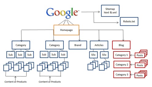
The above illustrates the Google Webpage Guidelines and shows the importance of a hierarchy of a well-structured website design, not only is this easy to navigate for a user, but it also has a knock-on effect on the technical setup and the content on the site. It helps to showcase related topics, create a web of content to highlight you as an expert, but also makes it easier for bots to crawl your website so your content can be seen.
The addition of easy-to-digest page layouts makes it less overwhelming for a user. Clear buttons tell the user what they expect and encourage them to click, such as ‘Speak With A Team’, ‘View All Sale’, and ‘Read More’. Buttons and anchor text on the site make it simpler for a user to find what they are looking for.
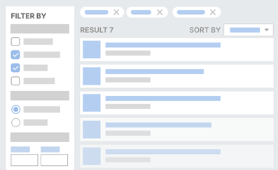
On commercial pages, you also need to make sure that your content is helpful and the UX is good to rank well. Users need to be able to get the information they need but also find the product they want to convert. This is where filtering by product type, colour, material, etc., as well as sorting by price, comes in handy. Design your filters to be clear and easy so that users can find what they are after as conveniently as possible.
Aspects Of Design For SEO
Now we’ve explained the relationship between UX and SEO, let’s explore what elements you need to focus on optimising for better rankings.
1. Site Navigation & Architecture
Your website architecture is all about how pages are organised and linked together, from site structure to how the pages are laid out on the site. A clear site structure shows the relationship between pages, both informational and product-led and should be easy for search engines to find and scan your site. In terms of design, this is all about how easily and quickly users can find the information they need.
Related: A Simple Guide On How Google Reads Your Site
On your site, you’ll find this as creating a structure and grouping pages into categories. Having a straightforward navigation menu that describes your topics makes it easy for users to find a page or product.
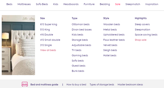
Your navigation affects important metrics such as time on page, bounce rate, engagement rate and, ultimately, conversion rate. Here are some tips on creating a good navigation structure:
- Keep the menu simple and limit the number of items to avoid confusion
- Avoid complex jargon in the main menu
- Use descriptive anchor text in the menu
- Make sure it’s easily accessible on all pages. This includes mobile devices
- Add a search bar so users can easily find a page or product
- All web pages should have clear, concise and descriptive URLs
2. Layout & Design
A well-designed website influences user behaviour, helping them find the right information at all stages of the journey and take their desired action. It also influences search bots to better access a page’s relevance.
First port of call: Make sure you use headings. One H1 per page should describe the page’s content, followed by H2 headings for more information. The layout and design of the page all depend on the user intent and the page’s type, but you should use content and images and conversion optimisation such as buttons, filters, contact forms, and call-to-actions where possible.
- Navigational Gateways: Homepages or hub pages should be less content and product-based but rather category-based. Signposting your key pages that a user would interact with and filtering them down the funnel by type. These pages should be visual but informational and are a way to organise a larger category, i.e. a Rolex Gateway would separate users into the types and models:
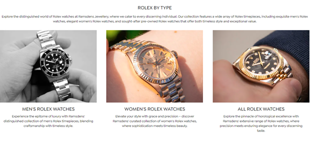
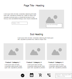
A good way to outline your gateways is to make sure that you have a goal in mind – do you want to filter them to category pages, provide education or inspiration, or maybe signpost USPs, banners etc? The below wireframe shows basic example of elements that you can find on a gateway or navigational page, including image tiles to signpost products, pages or guides, image and text placements, banners, CTAs and buttons, to showcasing articles.
- Product Listing Pages: Your PLPs should have top copy to describe the page followed by an easily digestible listing with details on each content block that users need to know (price, rating, colours, sizes, USPs). These pages should also have clear and helpful filters to give users insight into the type of product they need.
- Product Description Pages: These are your pages that show one specific product. They should have clear images, descriptions, and key features, and make it easy for a user to purchase an item.
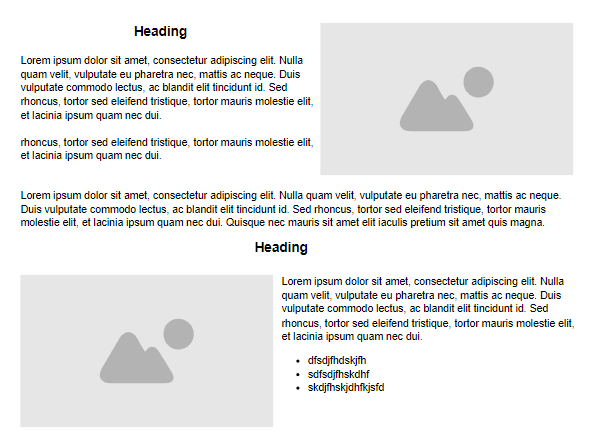
- Copy: Enhanced bottom copy and articles on the site should follow an easy-to-read layout broken up with images where possible. Make sure content is spread out and engaging for users to skim through, which follows eye flow and attention on the page, like the one below.
Related: Leveraging Guide Content For Maximum Category Performance
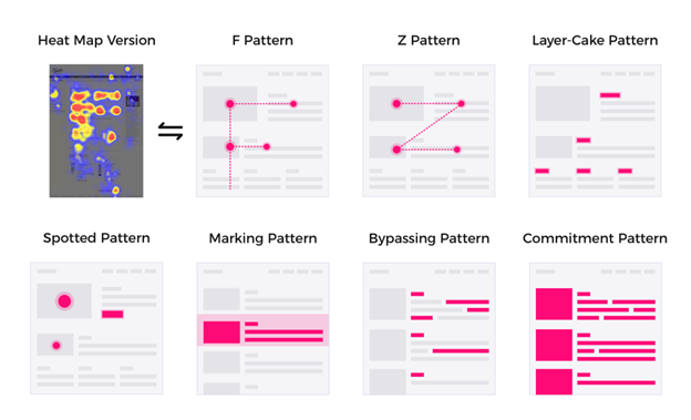
Outside of the design, you should ensure that you use F-patterns, Z-patterns, or directional content when laying out your site. This helps to keep a reader’s attention, increasing engagement and even conversions. For more information, read our Guide to Eye Flow, Attention, and Online Content.
3. Readability
Good UX isn’t just about the design and layout of your pages; you need to ensure that your content and site give a positive reading experience. From how you choose to lay out text and images to the colours and graphics you pick, your site needs to be easy to digest. For users, the more satisfying their experience, the more they will stay on your web pages, explore your site and purchase a product.
Some essential tips on readability are:
- Keeping background colours as light as possible
- Use white space to your advantage
- Consider larger fonts rather than smaller sizes
- Keep fonts legible, easy to read, and consistent on-site
- Spread out content on site with headings, subheadings, bullet points or numbered lists
- Choose to write in shorter sentences for better readability and break up paragraphs
- Break up blocks of text with images, graphs, videos or other visual aspects
4. Images
Good design incorporates images and visual aspects on your site, but it also helps to increase the average on-page time and engagement of a website. Images are easier to digest than text, making it simpler for a user to skim a page or shop for a product.
Using images of your products and user-generated content can help users visualise the product better and encourage conversions.
While images can be used to break up content, make content easier to digest and increase user trust, it can slow down your website, which site speed is important to SEO.
Here are a few tips for using images on-site:
- Make sure to use custom imagery to add credibility and authenticity to your website
- Images should be high-quality so images are clear and not pixelated
- To not reduce server load and increase your site speed, make sure images are compressed
- Make sure to add relevant keywords to the title of the image which explains what the image is
- Add a description and use alt-text to each image for search engines and those with screen readers to understand what the image is
Read more: Page Speed & SEO Complete Guide
5. Mobile First Interface
No matter what design layout your site has, it’s essential that it’s mobile-friendly. This is especially true since most traffic comes from mobile devices rather than desktop or tablet computers. Remember, most people always have access to the internet at their fingertips.
A good mobile-first design shows search engines that your site is helpful and valuable for a user, and easy to use. Your mobile layout should be simplified, and a responsive design should be used to ensure it looks good on any screen size, is functional, and highlights important information.
Here are some key insights for designing for mobile:
- Adjust Your Content: Content must be compact, easily readable and not too crowded.
- Prioritize Information: Not all content fits on mobile devices, so ensure you include the most important information and main content that a user needs.
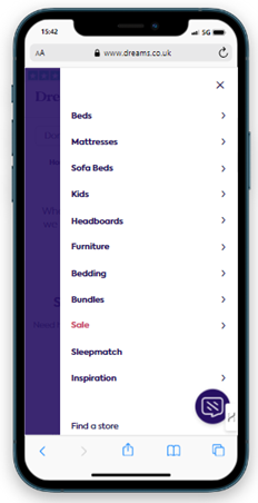
- Navigation: Since it’s a smaller screen, users can’t navigate as easily as when using Make it simpler with burger menus, which are smaller and compact, as well as direct links or bottom navigation to help.
- Buttons: Adding touch buttons or touchable links is important on mobile sites as users can’t use a mouse or keypad.
- Scrollable Content: To signpost content, related pages, or products in a more engaging way, carousels that users can scroll through rather than a vertical list are used.
- Page Speed & Page Length: Always check your loading speed so users can experience a seamless shopping experience, and keep page length to a minimum so users don’t endlessly scroll.
On mobile, you must ensure your site is simple and stripped back without losing the most important information a user needs with CTAs, buttons and easy navigation.
UX & SEO: Maximising Rankings
Ultimately, website design does affect SEO; this includes the layout and design from UI as well as how a user experiences and interacts with your site. Good design results in sites that look trustworthy to a user and are simple and easy to navigate, fast to load and work on mobile. All of these show search engines that your site is valuable to a user. Pair this with technical foundations and high-quality, helpful content, and you’ll see increased metrics such as traffic, engagement, and conversion.
At Salience, we integrate SEO with UX to ensure your site isn’t just set up correctly, running smoothly, or optimised for keywords and user intent but also matches your design and layout. For more information, check out our Marketing Services, from UX, Tech, and Content SEO to Paid Media and Digital PR. If you want to chat with us, contact our team or request a free SEO audit today!
