Snapfish are a photo printing company that sell a range of products from personalised cushions to magic mugs. Our UK Gift Industry Report 2022 outlines the seasonal trends, overall site visibility and authority, content performance, and overall performance sitewide. And this year, Snapfish has caught our attention.
With a 35% visibility increase YoY from 2021 to 2022, Snapfish has substantially increased its overall SERP rankings within the year. For more information on how this brand and the rest of the industry are performing, read our Gifts and Gadgets Market Performance Report.
So, back to Snapfish. How do they target high-value traffic & commercial intent through their site?
1. Occasions and Seasonal Events
Snapfish has card options for every occasion you can imagine, as well as gifts, calendars, photo prints, canvas prints, wall art, and more! Here we look at the 10 top-performing pages sitewide. From their ranking keywords, we calculated an average ranking position, keyword difficulty, and average monthly search volume for each page to determine which pages were ranking for the highest-ranking keywords. Take a look at the results below:

The top 10 pages listed above include Father’s Day & Mother’s Day pages which target high value keywords such as: ‘Father’s Day gifts’ and ‘personalised Mother’s Day gifts’. Throughout the year, numerous events occur, including Mother’s Day and Father’s Day, meaning people will be looking to buy gifts and cards for their loved ones. Offering a range of products for the user and making them visible on search engines can make all the difference to your website traffic and overall visibility. It’s important at these times of year to increase internal links to these pages from authority pages such as your home page to ensure users and search engines recognise the increased importance.
2. Mega Navigation Accessibility

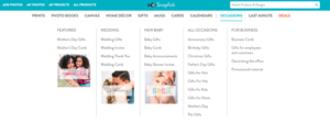
The mega navigation is one of the first things people look at when visiting a website to find what they are looking for. The mega navigation should be as accessible as possible and enable users to find the category page they are looking for quickly.
Snapfish mega navigation is a great example of good user experience and accessibility. They organise each category into subcategories which can help users filter their search.
At the beginning of each year, month or even week, gather any important dates for days surrounding your business, for example, the gift industry would include Mother’s Day, Father’s Day, Christmas, the queen’s jubilee, etc. Outlining these key dates will increase your visibility score for your website.
But Snapfish has been very clever and gone one step further…
3. Imagery Inspiration for Upcoming Occasions
On each individual category page, all the featured images on model mugs, cushions, cards, photos, canvas etc., include images of either a mother and son or mother and daughter, which targets the Mother’s Day event, giving a slight reminder to users or ideas as to what gifts would look like if they purchased the product and inspire them to make a purchase decision.

4. Banners
On all the category pages, for the likes of home décor, cards, mugs, etc images surrounding Mother’s Day has been implemented onto the top of the page in the form of a banner to further target the upcoming event of Mother’s Day, which in the marketing world is very clever.

5. Trust – Inspiring confidence in consumers
For any online business, reviews are critical; they help build trust and help users make a purchase decision. Trust can be a huge part of a business relationship between the user and the company. Acknowledging that previous buyers recommend their services and products gives new users that same trust.

Snapfish displays trust throughout their website by including the Trustpilot content strip plug-in. And they also build trust with the language they use with content across. Using terms and phrases such as ‘buy with confidence, ‘quality’, ‘photo printing the professional way’ portrays trust for users when purchasing the product. And in turn, it increases Snapfish’s authority, making them appear reliable and professional.
6. Gaining Trust by Showcasing USPs
Snapfish has outlined their USPs across multiple main landing pages, which showcases the number of different products available and reassures the users they will receive a bespoke service. Offering the user choices expands their product variety instead of being provided with limited services. The terms’ Professional Quality’ and ‘Paper Finish’ outline they aren’t a cheap business but want to provide the best quality products at a reasonable price.
Business Ideas and Inspiration
A blog on any website is beneficial for search traffic targeting long-tail keywords. And it can provide more information about a product or service to help users make a buying decision. Snapfish have their blog section hidden in the footer… which isn’t ideal. It’s important to make a blog visible to users, and you can do this by linking it in the mega navigation. Despite this, Snapfish does invite users to the blog by linking articles on category and product pages, widening content depth around categories.
Summary
Whether you are a new online company or have been in the gift market game for 20 years, keeping up with any small changes across your website can make all the difference. Visually and verbally.
Other aspects:
- The blog section is hidden in the footer – it isn’t getting enough exposure; however, it is linked to landing pages on the main product pages.
- When clicking on the ‘occasion’ dropdown on the meganav, e.g. for mother’s day, all different product options are available from mugs to cards, keyrings to photo books.
- Further down each page, there are tips on personalization for your chosen gift, which then links through to a blog, explaining different ideas etc.

