When I’m auditing websites, image optimisation has often been ignored more than anything, particularly from a technical SEO POV.
Even on the visual side, there is much to consider to make products look as appealing as possible to visitors. Our UX and CRO agency specialists collaborated with the eCommerce SEO gang to identify the absolute must-do’s to ensure your website is both well-optimised and converting.
Well optimised images help websites in general organic search as well as in the image vertical. However, they can have a big negative impact on organic performance. With page speed, for example.
Studies involving high-profile names such as Amazon and Shopify have proven a fast website leads to increased revenue, so as images are a huge part of most e-commerce websites, technical recommendations regarding speed can help conversion too.
I’ll start with conversion recommendations, but you can skip straight to the technical guidelines if you prefer.
Product Image Recommendations for Conversion
In physical stores you can feel products, play with them, smell them, see the size and shape and even hear them if necessary.
Some physical shops have their own signature smell, and there are businesses based on adding scents to retail stores. You’ve probably noticed that Subway smell if you’ve been anywhere near their sandwich franchises. Studies have shown this attack on the senses can increase our desire for a product and increase sales.
Online stores are also having to deal with an increasing number of returns, often processed at their own cost.
How do you create that same desire in an online store, while reducing returns?
Smell-O-Vision still hasn’t taken off (though technology is progressing) so you have to rely on the visual-side – and that’s where product photography comes in.
The more attractive a product looks to customers, the better conversion rate will be. And images are far more likely to elicit an emotional response than words.
Before starting, I should mention that while the below suggestions will work for many and are often best practice, they won’t work for all. There is value in A/B testing changes.
Use High-Quality Photos, Not Stock
I’ll get the stock photo hate out of the way first…

Many studies show standard stock photos are ignored – they can look bland and reduce trust. So if you have a generic smiling photo of someone enjoying a generic bowl of soup – replace it with a more realistic photo of someone enjoying your bowl of soup and see if more people buy.
It’s also important to use high quality, professional-looking images. To quote Norman Nielsen Group, “Invest in good photo shoots: a great photographer can add a fortune to your website’s business value.”
Highrise found photos of smiling customers increased conversions.
Show Products in Use
Most studies agree a product’s main photo should show the product alone, but including additional images showing the product in use can encourage purchases. This makes it easier for customers to see the product’s benefits and imagine it in their life.
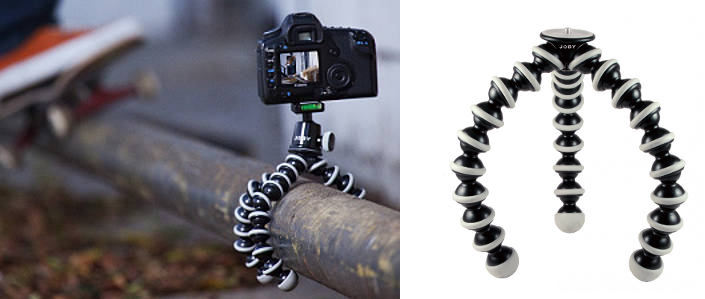
Although it looks like it’s about to get hit by a skateboard, the photo on the left shows off a Gorillapod’s capabilities better than the photo with a white background:
The old adage “show, don’t tell” applies. Does your product description of a suitcase describe how much can fit in it? Show this in a photo! If your product is impressively small, show a size comparison. That goes for any product where scale is important. If a product is unusual or potentially difficult to use, show it in use in a series of simple steps.
Not that I advise packing your boot (trunk) with a dog and child, but the point is the photo of the full car says more about the boot’s size than the photo of an empty car (P.S. can you tell this is a stock image? Although stock wins in looks this time – the image on the right isn’t crisp or clean enough):

Any people in the photos should represent the target market for the product.
If you sell baby related products, show a baby with the product. Charles Darwin talked about the instinctive reaction humans have to faces of infants, and more recent studies confirmed this.
You may also like – 10 Google Search Operators to Mine Search Results
Big Photos = Good (When Requested)
So says Nielsen Norman Group. Many studies have reported larger product images increase conversion rates.
Be mindful of fitting the photos in with your site design, and take into consideration the longer download times for larger images, which is where clickable images come in. According to the Nielsen Norman study mentioned above, users like a clickable image – though can get annoyed if the image isn’t at least twice as large as the original. Some e-stores manage to make the clickable images smaller than the original. If the images are smaller or not significantly larger, don’t bother having clickable images.
Larger images are especially useful for products that require closer examination or have intricate details – fabric texture or a handmade item, for example – and completely inappropriate for others. I’m not sure how a close-up of a plain steel spoon is much use to a customer. Again, this is something I’ve seen.
An alternative to clickable is zoomable images. This interaction can also make a customer feel more engaged than if they were looking at one static image.
Engaged visitors are more likely to buy.
To encourage further interaction, some websites offer an alternative image on category pages when the cursor rolls over a product. E.g. for clothes, the model showing a different pose or a close-up.
Most importantly, make sure images don’t interfere with user experience. Frustrated website visitors are likely to look elsewhere.
Be Consistent
Many e-commerce stores display products on a white background. This helps customers focus on the product itself and easily compare differences between thumbnails.
If you have similar products photographed on different backgrounds, some products centred in the photo and others offset to the left, it’s difficult to compare products like-for-like.
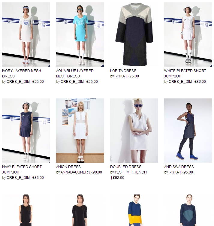
Personally, I think some backgrounds and added attire on models at Not Just A Label (pictured below) distract from the product and don’t always show the product at its best – in this case, the dresses – but as a contemporary fashion store, maybe it works for them. If they haven’t tested it already, I’d suggest they try consistent-looking photos with the products to the fore or even a close-up on rollover. Below, it’s difficult to scan and compare products:
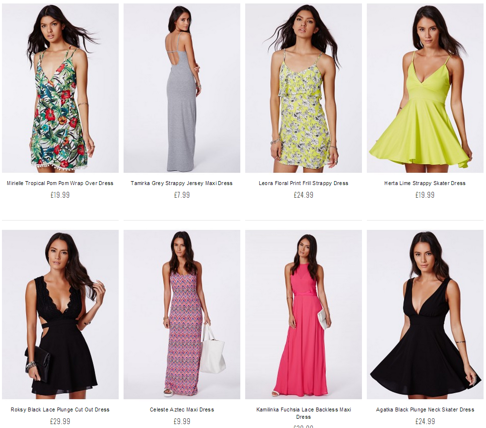
Somehow I ended up looking at dresses, but anyway, Missguided is a contemporary fashion store too. Although the models’ poses vary, the photos have a consistent look, making it easier to judge each item’s merits:
For some stores, a white background is more of a necessity. E.g. Amazon have thousands of different sellers, so simple guidelines to keep the product photography consistent help avoid the issues mentioned above.
Product photos can be consistent without using a plain background. Footballs look attractive on a bed of crisp green grass, for example.
If you have clothes on a mannequin or model, for the main product listings keep the product at a consistent angle in each photo. If the product photos are taken in context, keep the context similar so products are easy to compare at a glance.
Show Variations
If you’re selling cars or clothes available in different colours, for example, customers should be able to easily switch between the colours on the product page. Seeing the products in their preferred colour will give potential customers a stronger sense of what it actually looks like and make them more confident to buy.
Avoid pop-up windows that need to be opened and closed for each view as it can be tiresome for visitors (something else Nielsen Norman Group have researched).
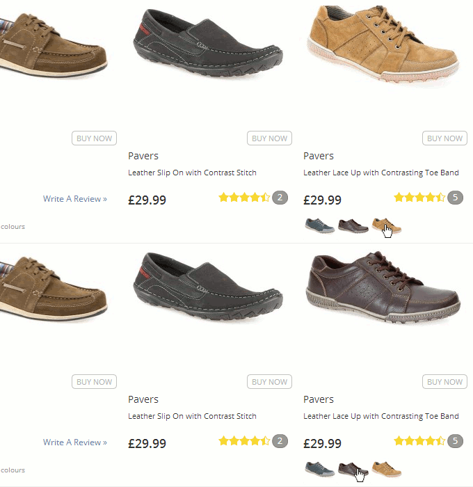
At pavers.co.uk, for example, products in different colours can easily be seen from category pages by rolling over a smaller thumbnail:
Alternate Views/3D/360°
Highlight a product’s best features.
This recommendation has been partly covered above: “Show Your Products in Use” and “Big Photos = Good (When Requested)”. A Nielsen Norman study I mentioned also found visitors like alternate views: “In our testing of product pages with detailed information about individual products, users paid even more attention to the product photos. People often liked alternate views and clicked the links to download enlarged photos.”
Alternate views may work better for products consumers would examine in a physical store, or larger items with more intricate details such as cars (from different angles, the interior etc.), and is completely inappropriate for some products – would you need to see a pencil from every angle? Console games and books are another exception, unless they’re a special edition with extra physical products, such as a fold-out book or hand-crafted artwork.
Alternate views can be taken to the extreme by creating 360° rotating images of products.
DueMaternity.com reported a 27% higher conversion rate for 360° spin images, compared to standard photos, and Golfsmith.com between 10% to 40% better conversion rate for products with a 360° view. However, these studies are a few years old so it would be interesting to see if 360° images could have the same impact today.
Creating 360° views can be expensive or difficult, and if implemented improperly, may negatively affect website load speed and user experience. Usually, the 3D should only become active if requested by the user. If you have a huge catalogue of products this is one recommendation that may be worth testing on a small number, though if some products are 360° and others are expected to be, it could lead to an inconsistent user experience.
For property, in many locations the 360° view might exist already. Some property websites embed Google Street View into their page, which enables prospective buyers to get a feel for the location before they’ve visited.
Augmented Reality
Ikea’s augmented reality app made the news in 2013, making it possible for customers to virtually place items in their home to see if they will be the right fit:
Whether the augmented reality app has increased sales (the publicity it generated aside) is yet to be revealed. Reports stated other large retailers (including Littlewoods and Very) were considering their own augmented reality catalogues. We are still waiting for those two, though Argos have launched their own augmented reality app for some products.
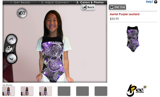
For clothes, virtual dressing rooms are yet to take off but will probably become commonplace. Zugara are one company working on this technology; with a webcam you can position clothes over your body:
Augmented reality is becoming standard in one area. Many glasses retailers have a virtual “try on” option that requires a webcam photo or upload of a straight-on headshot, which tends to work quite well. Inkhunter (for tattoos) and Diamond Hedge (for rings) are other good examples.
Outside of glasses, tattoos and jewellery, Sephora Virtual Artist, for ‘trying on’ makeup, is another example. But although Pokemon Go proved augmented reality can be a huge success, there is some way to go until augmented reality solutions for e-commerce are usable enough to become commonplace.
Avoid Auto-Scrolling Image Carousels
Some conversion experts hate these as much as stock images. Many studies have reported auto-scrolling image carousels are an annoyance to users and actually reduce clicks and conversions.
One such study, by Nielsen Norman Group (yes, them again), mentioned various reasons including banner-blindness, reduced accessibility – and “It’s just plain annoying for users to lose control of the user interface when things move around of their own accord.” I find them hugely annoying for that reason.
Don’t Mislead Visitors
This can happen unintentionally e.g. showing a shirt with a tie when only the shirt is for sale. In the buying process, you don’t want to put the smallest doubts in a potential purchaser’s mind.
Saying that, it can work the other way. Photos of sliced ham with garnishing can perform better than the same photos without garnishing. As with everything – test – find out what works best for the target market.
Use Social Media Images and UGC
Visual social networks can work well for e-commerce stores. A November 2013 study by Piqora placed Pinterest as the most valuable network in terms of the sales generated by an average post (e.g. comparing Pins to Tweets). But before you pin every product, read Shopify’s Pinterest articles.
Most people dislike being overtly sold to, so it’s best to think of social network posts as adverts that don’t look like adverts, keeping a look out for trends to relate products to. Use Throwback Thursday (#tbt) on Instagram, for example, to post retro product photographs or adverts (below is Michelle Obama sharing a picture of herself and Barack on the left):

Many brands do well by encouraging customers and fans to share content related to their products. In the fashion industry, for example, photos of customers wearing the products.
While some social channels work better than others for visual reasons, there’s no reason why you can’t utilise them all. Wise Merchant’s Ecommerce Startup Guide gives some great examples of using social to promote brands.
What if My Product Isn’t Physical?
For e-books or download-only software, for example, it makes sense to show a physical representation of a book or software box as it makes the product seem real in a customer’s mind. For software, screenshots can be used too. As long as you’re not misleading the customer (e.g. a picture of a book that looks like it has 200 pages when the e-book only has 10 pages), and it’s clear the product is digital-only.

