It’s been X months since we released our Flooring Market Report – analysing the growth of each brand YOY. Exploring the sector more since then, we’ve noticed those who continue to grow have a strong focus on developing trust with their audience.
From the collection and presentation of reviews across key touch-points to the easy access of editorial policies and identification of who’s behind your content, those growing sites place trust at the heart of their digital strategy – important in the changing world of AI.
There are some brands that haven’t yet quite caught on to the importance of making trust a central part of their business strategy. By analysing a top of market brand in Flooring Superstore, we hope this article will give them such much-needed inspiration for taking their trust game to the next level. We’ll even include references to Google Page Quality Guidelines to add a level of, you guessed it, TRUST to what we’re saying.

A Shining Example of E-E-A-T: Flooring Superstore
This brand’s approach to trust has been home-run material for a while – going back to 2021, we can see the implementation of reviews across multiple user touch-points. We’re huge fans of brands like this – those that take best practice user experience and SEO and implement into it their company-wide strategy.
We often say that if you’re seeing any type of impact from algorithm updates – whether positive or negative – it’s more to do with your broader digital strategy than anything specific. So, it’s no surprise that Flooring Superstore grows year on year – they’re not trying to cheat their way around what users and search engines deem a good digital experience with cheap, quick fixes. Instead, trust is at the heart of their approach.
And that’s important in a world of informed consumers. With access to review platforms, social media, forums and news articles a-plenty, consumers can find out all they need to know about a brand with a single search. By focusing on trust, you answer their questions on-site and reduce the likelihood of them leaving to check up on what people are saying about you elsewhere.
Building trust from the off with home page optimisation
As one of the most important pages on any website, ensuring your home page must provide users with easy access to information about who you are and what customers think of your service.
In this vein, Flooring Superstore use a USP bar and content modules across their home page. With a prominent and visible trust icon in the top banner, users are made aware of the sites positive reputation. It’s even linked to a page dedicated solely to reviews too – ensuring users who want it have easy access to find out what other customers have said about the brand.
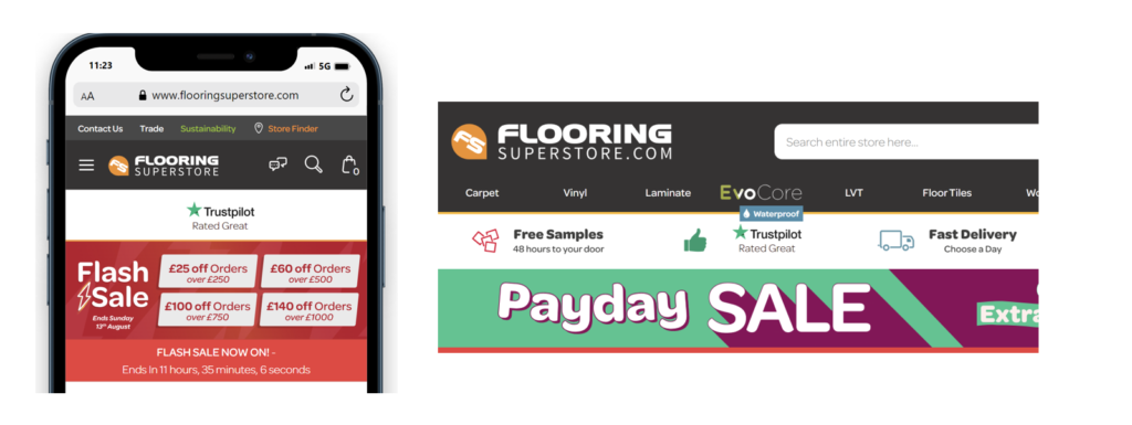
There’s a second implementation of review content further down the page. This gives information on the content of their 5-star reviews – discussing the brand’s service (think: delivery, returns etc.) and price points (“offering an unbeatable price”).
This 5 star module is then followed by a link through to their help centre which provides FAQs, guides, advice and answers to questions about flooring.
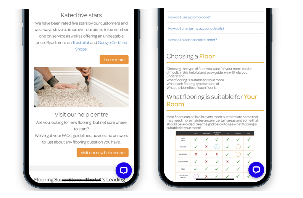
Clearly, this brand aren’t just resting on their laurels and shouting about reviews; they are focused on ensuring users have easy access to answers to their questions too. With the Helpful Content update of August 2022, it’s no surprise that websites that build trust and expertise through content are dominating the visibility charts. As you can see in the example above, helpful content is everything from information on the service (promo codes, delivery, ordering samples) alongside product guidance such as product suitability and benefits.
Why and how navigational category landing pages can inspire trust:
Not all users will land on your homepage, particularly those who aren’t already aware of your brand, so it’s even more important to incorporate trust throughout other areas of your site. Going a little further down the funnel into top level category pages, we can see more reviews blended alongside trust-inducing signals.
First off, the obvious trust bar with customer reviews is repeated. However, a real indicator of trust is good usability and an understanding of how consumers shop. The most trust-worthy websites are those who understand their users and provide them with the easiest way to find their perfect product.
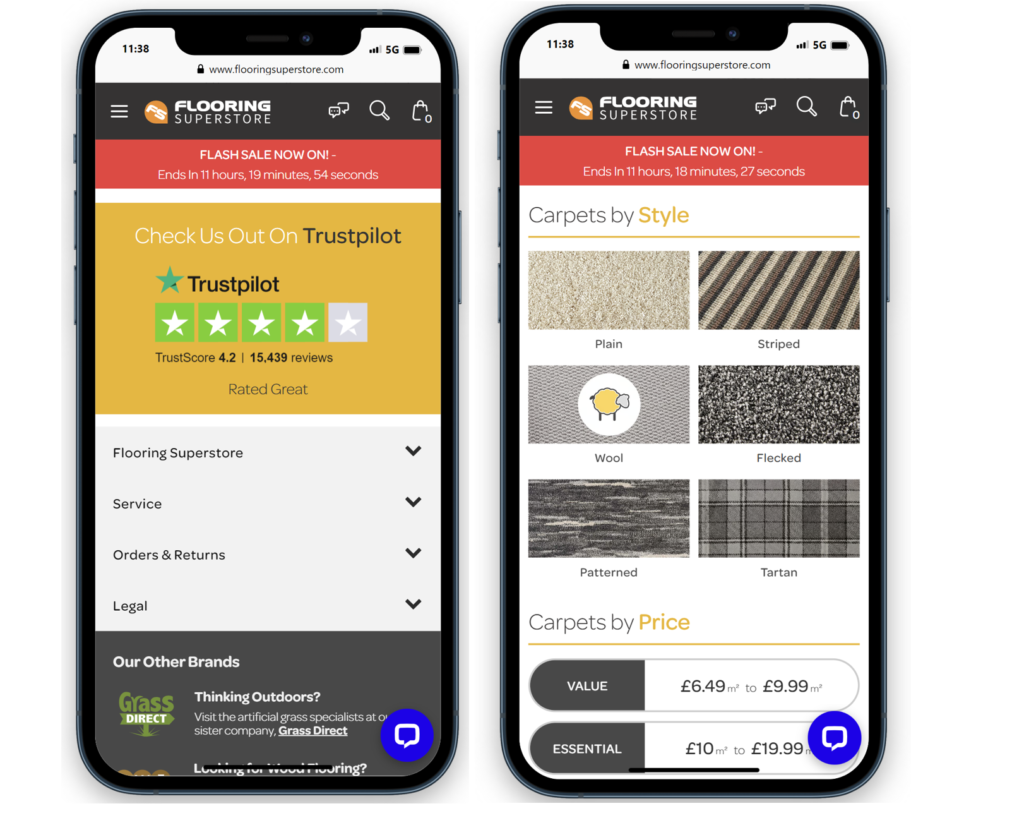
Rather than presenting hundreds of types of carpets in a product listing and asking users to do the hard work, the websites at the top of the visibility charts allow users to curate their own selection by providing options to shop by colour, style, room, price, pile type and more.
There’s no laziness here.
Rather, a comprehensive of all the buying considerations that a shopper for carpets may have and a clear presentation to suit. Think about it, it’s no different in store. You wouldn’t want to go into a supermarket where each aisle was a a hodgepodge of items rather than clearly demarcated ranges and lines. And if you take the supermarket example to the next level, they go further and group similar products close to each other. Coffee, tea, juice are all near each other on the one aisle. Spices are ordered by colour. Loaves aren’t far from wraps and pittas.
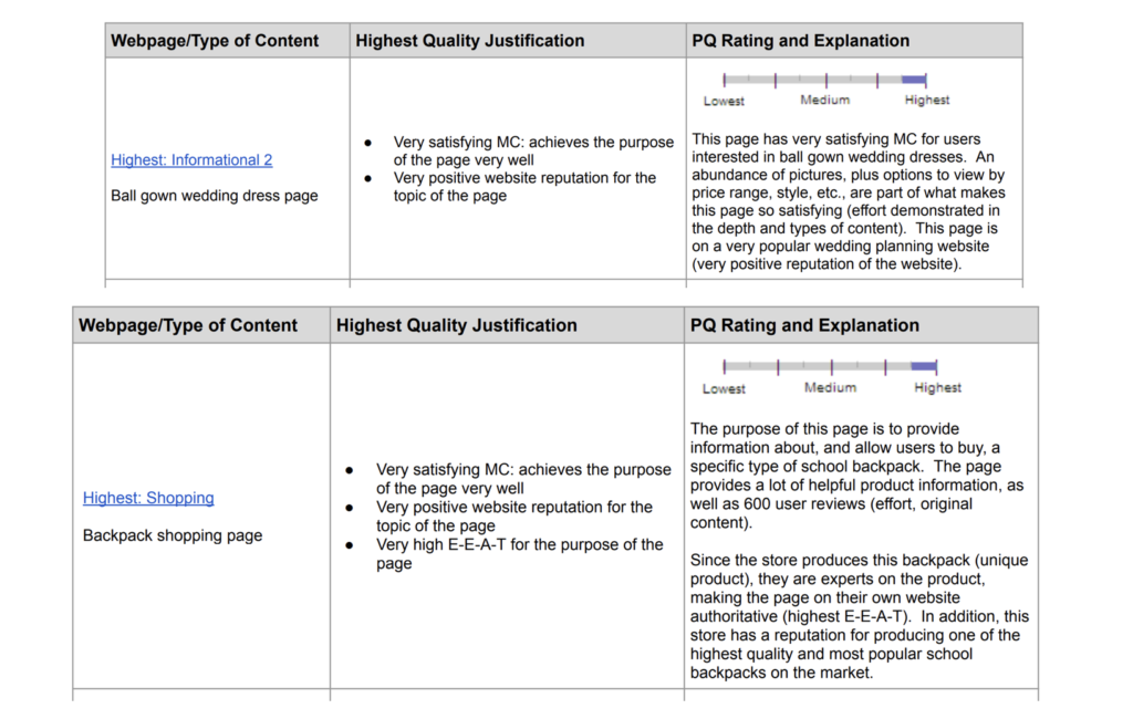
And you can see why this is important in the below screenshots from Google Page Quality Guidelines. Take note of language like “positive website reputation” and “effort demonstrated in the depth and types of content” – all achievable concepts when focusing on reviews and providing the best web experience possible.
Building trust further down the funnel through PLPs and PDPs:
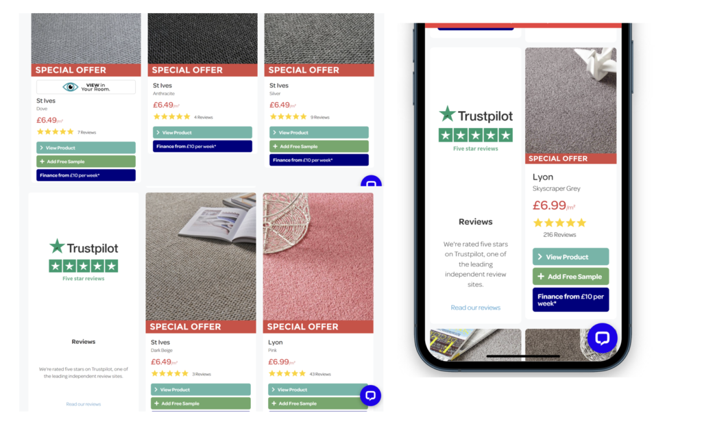
Going one step further down the funnel, we can again see prominent reviews for each product – both the star rating and the number – and through the incorporation of a trust-module tile into the product grid. So far, from the home page to the first category page and now into the PLP, users are consistently hit with signals and iconography that exude expertise, authority, and trust.
This continues at PDP level too. Take a look at the below screenshot which shows the first section beneath the product image, price and order buttons:
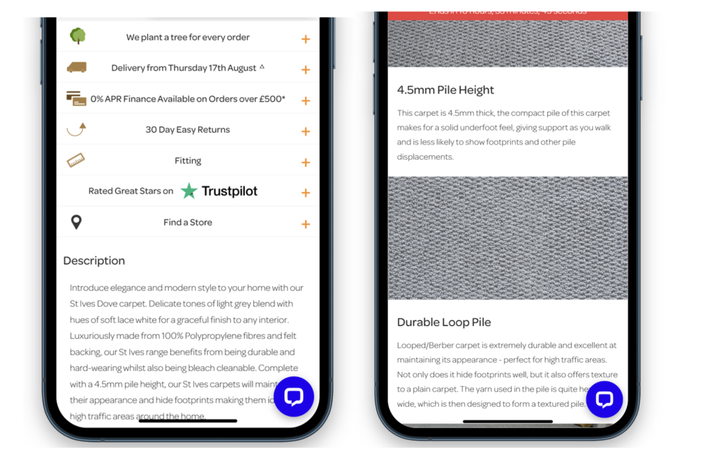
Note the clear menu of information which indicates sustainability, product specific delivery dates, finance options, returns info, fitting advice, trustpilot reviews and links to store. Every question a customer could have about the process is answered here. Then comes the detail about the product. Substantial information is provided through text and imagery. For those who don’t engage in that type of content, more information follows in visual form: a breakdown of the product across numerous factors (softness to warmth and density) as well as room suitability. Then we begin to see more in detailed specifcations of the product and guidelines about how much it will cost for different sizes of room.
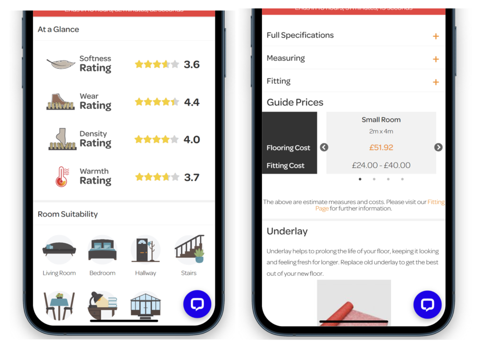
Eventually, we are left with a related product for underlay – a key part of the purchase. Finally, we’re left with even more detail on what consumers think of the product through a large trust module:
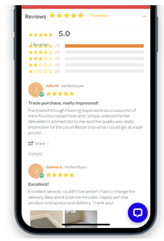
In short, Flooring Superstore has ensured that at every part of the user journey, customers are regularly presented with consumer reviews of their service and products. They’re backed up by information about what’s important to users, from samples and delivery to product information, pricing and installation.
